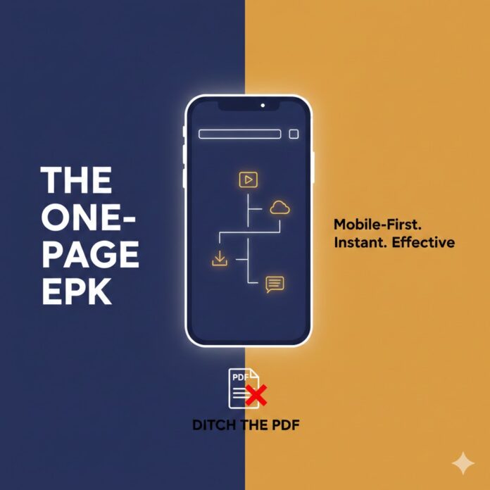
Stop Sending PDFs: Why Your Press Kit Needs a Mobile Makeover
Let’s be honest: when was the last time you enjoyed opening a 15MB PDF on your phone?
If you’re sending your music to festival bookers, playlist curators, or bloggers, you’re hitting them up while they’re in line for coffee, sitting on a train, or scrolling between meetings. They are almost certainly on their phones.
If they click your link and see a “Loading…” wheel or have to pinch-and-zoom just to find your contact info, they’re going to close the tab. In the time it took for your “Professional EPK.pdf” to download, they’ve already moved on to the next artist.
It’s time to ditch the clunky files and build a One-Page, Mobile-First EPK. —
Why the Traditional EPK is Killing Your Opportunities
The old-school press kit was designed for desktop computers and printing. But in 2026, the friction of a static file is a dealbreaker:
-
The “Scroll or Die” Rule: People want to flick their thumb, not zoom in on tiny text.
-
Outdated Information: Did you get a big sync placement or a rave review last week? If it’s in a PDF, that info is already “frozen” in an old version.
-
Too Many Clicks: Every time you make someone leave their app to download a file, you’re giving them an excuse to quit.
The Solution: A Living, Breathing Landing Page
A modern EPK isn’t a file; it’s a high-speed experience. Think of it as a “digital business card” that looks stunning on an iPhone screen.
Where should you build it?
You don’t need to hire a web designer. Some of the best EPKs right now are built on:
-
Notion: Clean, minimalist, and incredibly fast. Plus, it’s easy to update on the fly.
-
Canva (Websites): Great if you’re visual-heavy. You can publish a “site” that’s just a single, beautiful vertical scroll.
-
Linktree (Pro): If you keep it organized, a dedicated “Press” link in your bio can act as a lightweight kit.
What Actually Belongs in a One-Page EPK?
Busy people skim. Don’t give them a novel; give them the highlights.
1. The “10-Second” Hook
Put your best photo at the top and a one-sentence “elevator pitch” right under your name.
-
Bad: “We are a band that plays music influenced by many genres.”
-
Good: “Gritty, 90s-inspired grunge from Seattle—for people who miss early Nirvana.”
2. The “No-Exit” Music Player
Don’t send them to Spotify (where they’ll get distracted by notifications or ads). Embed a SoundCloud or YouTube player directly on the page so they can hear your sound without leaving the site.
3. The “Press Folder” (Keep it tidy!)
Instead of cluttering the page with files, have one big, obvious button: “Download Media Assets.” Link this to a Google Drive folder containing:
-
3 high-res photos (give them both a vertical and a horizontal option).
-
Your latest bio (a 50-word version and a 200-word version).
-
A transparent PNG of your logo.
4. Social Proof (That isn’t just follower counts)
A screenshot of a major playlist addition or a quote from a respected blog carries more weight than a “bio” you wrote yourself. Show them that other people are already paying attention.
The “Coffee Shop” Test
Before you send your new link to a single person, do this: Open it on your phone using one hand while walking or standing in line. If you can’t get a feel for the music and find a contact email within 15 seconds, it’s still too complicated.
The goal isn’t to show off every single thing you’ve ever done—it’s to make it impossible for them to say no because you made their job so easy.


 🔥 Limited Time: Get 55% OFF All Plans - Ends in: